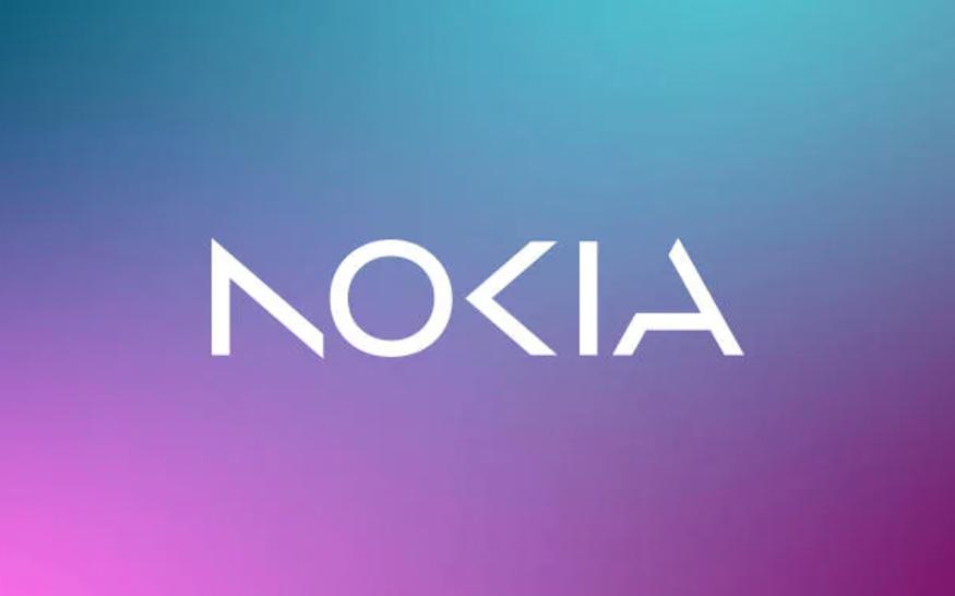
Nokia, on Sunday, announced its decision to rebrand and change its iconic logo for the first time in nearly 60 years.
Gatekeepers News reports that the new logo comprises five different shapes forming the word NOKIA. The iconic blue color of the old logo has been dropped for a range of colours that it claims are more modern and digital.
The unveiling of the new logo comes before the official start of Mobile World Congress (MWC). The will start in Barcelona on Monday, March 27th and runs until March 2.
The ex-mobile phone maker’s CEO, Pekka Lundmark, told Reuters that the rebrand is part of a conscious strategy to move away from being associated with smartphones, which the Finnish company hasn’t made for more than 10 years, following its ill-fated deal with Microsoft.
“There was the association to smartphones and nowadays we are a business technology company,” Lundmark says. “In most people’s minds, we are still a successful mobile phone brand, but this is not what Nokia is about,” he added in a separate interview with Bloomberg.
He also made it clear that the company is focused on new challenges: “We want to launch a new brand that is focusing very much on the networks and industrial digitalization, which is a completely different thing from the legacy mobile phones.”
Nokia-branded phones are still being sold and developed by partner company HMD Globall, which unveiled the Nokia G22 recently. But Nokia itself has long since moved away from manufacturing phones.
Nokia is now looking to rapidly expand its focus on selling gear for automated factories and technology such as private 5G networks for clients in the manufacturing sector.